The Overview

Introduction
Healthcare is an industry where speed and accuracy are paramount. As a healthcare provider you need to be able to provide your patients with the services they need as quickly as possible and often that is determined by the distance between your services and the patient's location. Your clinic attendance rate has been struggling of late and you're keen to understand why? Is there a cluster of patients that would benefit from a new clinic located nearer to them? A location that is easier to access for your patients will have a higher attendance rate.
SOLUTIONS
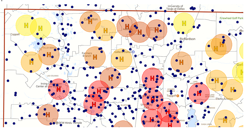
Pin Map : Using advanced styling options, a simple pin map can become a powerful analysis too.
Radius Analysis : Using radius analysis you can identify the patients that live within a 5-mile radius of your clinic locations.
Exporting to JPEG : When presenting your analysis and findings to key stakeholders in your organization, a visual aid is a great way of ensuring that they can see what you see.
Exporting to CSV :Some people like to see the raw data so you can export the findings, such as the number of people that live outside a suitable distance from a clinic, to an excel document for further examination.
Exporting to PPT :Quickly export a single map or collection of maps directly to PowerPoint for presentations.
RESULTS
Mapping is a great way to solve problems such as attendance rates at health clinics.
By plotting your data on a geographical map allows you to see it in a very clear and different perspective. Without the geographic aspect, you may be making assumptions that clinic locations are serving your patients well, when in fact, you need more or less or need them in slightly different locations to see a massive improvement in attendance.
You get a single view of your patient and clinic locations and you can run various analysis such as radius to ensure you are providing an accessible service to your patients.
